Most landing pages don’t fail because of bad design. They fail because somewhere between the ad someone clicked and the page they landed on, the experience quietly fell apart. The message didn’t carry over. The page took too long to appear. The form asked for more than it had any right to. The CTA existed but gave nobody a real reason to act on it.
Landing page optimization in 2026 isn’t about running through a generic checklist and calling it done. It’s about understanding the specific points where visitors disengage and fixing those with intention, not guesswork.
Here’s what’s actually moving conversion numbers right now.
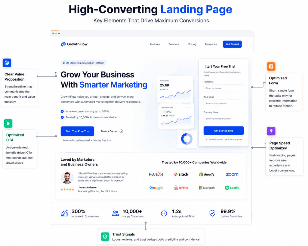
Start Above the Fold
The space visible before anyone scrolls is where most landing pages are won or lost. If a visitor lands on your page and can’t immediately grasp what you’re offering and why it should matter to them, they leave. Usually within a few seconds, often less.
Your value proposition needs to be the very first thing someone reads, not something they discover halfway down after scrolling past a hero image and a tagline that says nothing. It should answer three things without making anyone search for the answers: what you offer, who it’s built for, and why it’s worth their time over everything else they could choose.
Headline, subheadline, primary CTA. All visible without scrolling. That’s the baseline expectation in 2026 and there’s no compelling reason to drift from it.
Message Match Still Gets Ignored
This is more common than it should be. Someone clicks an ad promising something specific, lands on a page pitching something adjacent, and immediately gets the feeling they’ve been redirected somewhere wrong.
Message match means the language, the offer, and the tone of your landing page should directly mirror whatever brought someone there in the first place. If your ad reads “free 7-day trial for small teams,” your landing page headline should echo that closely, not pivot to a broader product pitch that technically covers the same thing but feels completely different.
Mismatched messaging is one of the less obvious reasons bounce rate stays stubbornly high on pages that appear perfectly functional on the surface.
Page Load Speed Is Still Doing More Damage Than People Realize
A one-second delay in page load speed can meaningfully reduce conversions. That’s not a new finding but plenty of landing pages are still loading slowly in 2026 simply because nobody has gone back to audit them. Unoptimized images, unnecessary third-party scripts, and render-blocking code sitting quietly in the background.
Run your page through a proper speed diagnostic. Identify what’s actually causing the delay rather than assuming. The gap between a two-second load and a four-second load isn’t just a technical metric. It’s a conversion gap with real revenue attached to it.
Social Proof Has to Feel Earned
Vague testimonials with no context and no specifics have lost most of their persuasive power. People have encountered enough of them to recognize when something has been curated purely for optics rather than genuine validation.
Social proof that holds weight in 2026 is specific and attributable. A real name, a measurable outcome, a recognizable company where relevant. Video testimonials carry more credibility than text alone. Case study excerpts that reference actual numbers rather than general praise. Star ratings that link to a place where the full reviews can actually be read and verified.
If your testimonials currently say things along the lines of “fantastic product, would definitely recommend,” they’re probably not doing the conversion work you’re counting on them to do.
Form Friction Is Quietly Costing You
How many fields does your form have? Because every additional field is another moment where someone pauses and reconsiders whether this is worth the effort.
Reducing form friction is one of the more straightforward conversion wins available and one of the most consistently underutilized. If you’re collecting information you don’t genuinely need at this stage, cut it. A first name and an email address is usually sufficient to move someone into your funnel. Everything else can be gathered once the relationship has been established.
Multi-step forms are worth testing here too. Spreading fields across two or three short steps feels considerably less demanding than presenting ten fields on a single screen. Completion rates tend to climb when the first ask is minimal.
Landing Page CTA Optimization Goes Beyond the Button
Your landing page CTA optimization is simultaneously a copy decision, a placement decision, and a relevance decision. Treating it as purely a design consideration leaves a lot of conversion potential untouched.
Button copy matters far more than most teams invest in it. “Submit” communicates nothing about what happens next. “Get my free audit” or “Start your trial today” tells someone exactly what they’re about to receive. Specific, outcome-oriented CTA language consistently outperforms generic alternatives across almost every category.
Placement is equally worth considering. Above the fold matters, but repeating the CTA at natural stopping points as someone scrolls gives them multiple opportunities to convert without requiring them to scroll back up to find it.
A/B Testing Is How You Replace Assumptions with Evidence
Everything covered above is a strong starting framework, not a guaranteed formula. What performs on one landing page won’t automatically translate to another because audiences differ, offers differ, and the contexts people arrive from differ significantly.
Landing page A/B testing is how you move from educated guesses to actual data about what your specific visitors respond to. Test one variable at a time. Headline copy, CTA phrasing, form length, hero image, page structure. Give each test enough traffic to produce statistically meaningful results before drawing conclusions and acting on them.
Testing isn’t a phase you complete. The pages that consistently increase landing page conversion rate over time are the ones being actively refined on an ongoing basis, not optimized once and left to perform indefinitely without review.
Bringing It Together
A high-converting landing page in 2026 doesn’t require complexity but it does require deliberate attention to the details that actually influence behavior. A sharp value proposition above the fold, messaging that carries through from the ad, fast load times, credible social proof, minimal form friction, purposeful CTA copy, and a testing cadence that keeps compounding improvements over time.
Landing page optimization is only one piece of the larger puzzle, though. If you want to understand how conversion rate optimization trends and tools are reshaping the way businesses approach growth this year, that’s worth exploring as a next step.