
While your website might have world-class copy, amazing imagery and an awesome product, if you don’t have a next step, your visitors will just simply walk away. The Call-to-Action (CTA) button is where it comes in. CTA buttons are important connections from the casual user to the real business revenue. They are maybe the most vital conversion levers on any site and in fact are digital signposting that helps users perform a desired action.
A well-designed CTA button can significantly impact your sales and lead generation and can eliminate friction from your user journey. The design of the button is not simply an aesthetic consideration, but it is also an integral part of human behavior. User experience (UX) is a key element in successful online design when applied in conjunction with visual psychology; it can convert passive browsers into active buyers. The Psychology of the CTA can help you make the design elements more relevant to the exact subconscious trigger that makes them more action worthy. To reap the full benefits of your website, it’s essential to adopt effective CTA button design tips and practices.The best approach to turning website traffic into a steady, scalable stream of leads or conversions is to use proven CTA button design best practices.
1. Use Clear and Action-Driven CTA Text
Vague text is a silent conversion killer. Buttons that say “Submit,” “Next,” or “Click Here” fail because they don’t tell the user what will happen next or why they should care. Weak copy creates mental friction and anxiety, which ultimately reduces clicks. Direct, clear CTA copy always outperforms ambiguous alternatives because it establishes immediate intent.
To craft an effective CTA button design, your text must be action-focused, short, and benefit-oriented. Use strong, commanding verbs that highlight exactly what the user stands to gain upon clicking. Benefit-driven CTAs outperform generic ones because they focus on value rather than the effort required.
- Generic: Submit
- Benefit-Driven: Claim Your Free Trial
- Generic: Download
- Benefit-Driven: Get Your Free Guide
When refining your call to action button design, ensure the text completes the user’s subconscious thought: “I want to…” Keeping the copy punchy and value-centric ensures users feel rewarded rather than burdened by taking the next step.
2. Choose CTA Colors That Stand Out
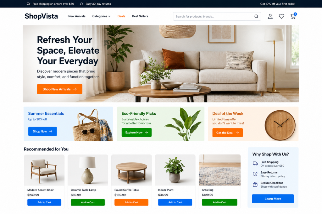
Color psychology plays a massive role in how users perceive your brand and interact with your site. However, there is no single “magic” color that universally guarantees higher conversions. The true secret to creating high converting CTA buttons lies in visual contrast and immediate visibility.
Your CTA button needs to pop out from the rest of the page layout. If your website palette relies heavily on blues and grays, a blue button will blend into the background noise. Instead, look for an isolated accent color that commands attention.
- Red & Orange: Create a sense of urgency, excitement, and aggressive attention.
- Green & Blue: Associated with growth, safety, and trust ideal for financial or SaaS platforms.
The ultimate goal of CTA button optimization is to balance brand consistency with aggressive conversion visibility. Your button must look like it belongs to your brand ecosystem, but it must completely dominate the visual hierarchy of the specific screen section it occupies.
3. Make CTA Buttons Large and Easy to Click
Size matters when it comes to user interface design. If your button is too small, users will look right past it. Worse, they might try to click it on a touchscreen, miss the target, get frustrated, and abandon your site entirely. Conversely, oversized buttons can look cartoonish and desperate, which disrupts page harmony.
Finding the ideal CTA button sizing is essential for accessibility and usability. For desktop screens, your button should be noticeably larger than surrounding body text. For mobile devices, sizing becomes a strict matter of physical ergonomics. The minimum target size for a touch-friendly button should be around 48×48 pixels to accommodate the human thumb.
By applying smart padding and generous dimensions, you elevate your site’s conversion-focused UX design. Making buttons easy to target reduces the physical and cognitive effort required to convert, turning a clunky interaction into a seamless experience.
4. Place CTA Buttons Strategically Across the Page
Users have been conditioned by years of web browsing to expect certain structural layouts. When you fight these expectations, your conversion rates suffer. Strategic placement ensures that your CTA is present at the exact moment a user decides to take action.
- Above the Fold: Always place a primary CTA in the hero section at the top of your page. Visitors should know exactly what action to take within three seconds of landing, without needing to scroll.
- Repeating CTAs: On long landing pages or extensive content pieces, repeat your CTA at logical intervals. Don’t force users to scroll all the way back to the top just to buy.
- E-commerce Layouts: Place your primary action button immediately adjacent to product images and pricing.
For inspiration, study successful platforms like standard Shopify homepage design frameworks to see how seamless, predictable button placement drives automated sales without interrupting the user journey.
5. Use Whitespace to Draw Attention to CTAs
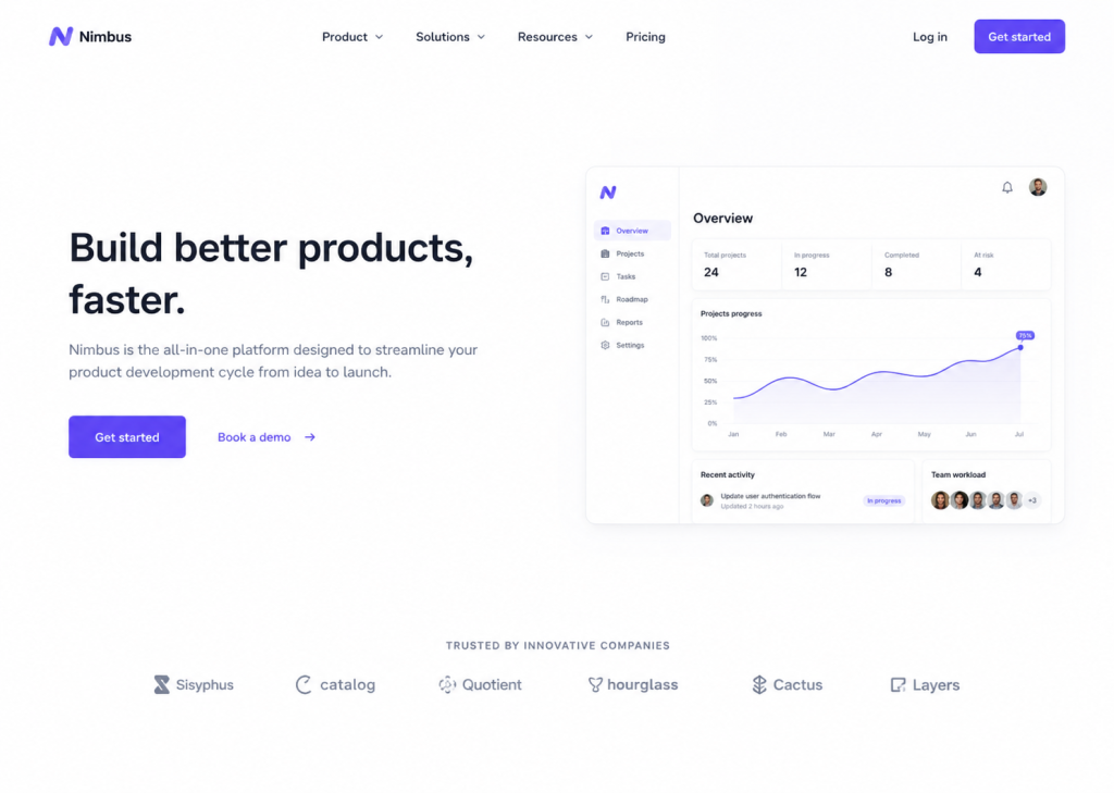
In some cases, the best approach toward making an element more prominent is to remove elements around it which are distracting. The whitespace around an element is one of the most basic elements used to create a strong visual hierarchy.
Too many paragraphs, icons and flashing banners on a CTA button makes for intense visual clutter. The user’s eye doesn’t know where to rest, resulting in choice paralysis. You can increase the amount of blank space around your button, which will help to make the button stand out and make it more obvious where to click. When you use whitespace in your effective CTA button design, you will give your real CTA buttons breathing space, making the text easily readable, alleviate the visitors’ apprehension, and draw 100% of the attention of your visitors to your primary goal.
6. Optimize CTA Buttons for Mobile Users
With more than half of global web traffic originating from mobile devices, a mobile-first CTA strategy is non-negotiable. Mobile user behavior is characterized by rapid scrolling, split-second distractions, and shorter attention spans, making optimized buttons critical to retaining traffic.
Responsive design best practices demand that buttons adapt to smaller screens fluidly. One highly effective mobile engagement tactic is the implementation of sticky CTA buttons. Pinned to the top or bottom of the screen as the user scrolls, a sticky button ensures the primary action is always one tap away.
Optimizing mobile button spacing and rendering speed also directly allows you to improve core web vitals ecommerce metrics, keeping your mobile bounce rates low and conversion rates high.
7. Create Urgency Without Overdoing It
Urgency and scarcity are powerful psychological drivers. When users feel that an opportunity is slipping away, they are much more likely to bypass procrastination and act quickly. However, there is a fine line between creating authentic motivation and sounding spammy.
Avoid aggressive, manipulative language or fake countdown timers, which quickly destroy user trust. Instead, use honest, time-sensitive copy that highlights genuine expiration or limited availability.
- Spammy: “!!! CLICK HERE NOW BEFORE IT’S TOO LATE !!!”
- Urgent & Professional: “Limited Time Offer – Save 20%”
- Scarcity-Driven: “Only a Few Spots Left – Register Today”
- Action-Oriented: “Get Started Today”
By keeping your urgency-focused CTA text grounded and believable, you encourage rapid click-through rates while protecting your brand’s reputation.
8. A/B Test Different CTA Variations
No matter how much industry research you read, you cannot predict exactly how your unique target audience will respond to a specific design. Continuous optimization requires running data-driven A/B tests.
An A/B test involves showing half of your visitors version A of a button, and the other half version B, to see which version yields higher click-through and conversion rates.
Element to Test | Variation A | Variation B |
Button Text | “View Pricing” | “See Plans & Pricing” |
Button Color | Bright Green | Vibrant Orange |
Button Shape | Sharp, Square Corners | Smooth, Rounded Edges |
By tracking actual conversion data over assumptions, you can uncover subtle visual preferences that lead to explosive growth. For best practices on structuring these experiments, integrate your tests into a comprehensive CRO Design framework.
9. Improve CTA Loading Speed and Performance
The most beautiful, psychologically optimized button in the world wouldn’t matter if the page elements are slow.Your users would leave your site before taking a second look at your button if the page elements are slow. Any slow loading features, heavy scripts or delayed rendering of buttons are a direct hit on user trust.
Don’t use large, unoptimized image files or overly complex Javascript animation for your buttons. The advantages of faster loading buttons are evident when it comes to user experience: when the buttons are fast, the user knows that your site is secure, responsive, and functional. CTA button optimization can enhance the performance of your website so that interactive buttons are always optimized for quick loading, improving the likelihood of grabbing impulsive clicking behavior.
10. Personalize CTA Buttons Based on User Intent
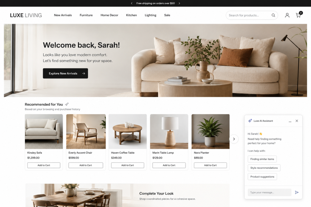
Generic buttons get generic results. Personalized CTAs target users based on where they are in their unique customer journey, resulting in significantly higher conversion rates than a one-size-fits-all approach.
Align your CTA copy directly with user intent across different audience segments:
- Top of Funnel (Awareness): “Learn More” or “Get My Free Quote”
- Middle of Funnel (Consideration): “Book a Demo” or “Download Case Study”
- Bottom of Funnel (Decision): “Add to Cart” or “Buy It Now”
By deploying dynamic CTAs, you can serve custom buttons to returning customers versus first-time visitors. For instance, updating a button on a Shopify product page design to reflect a user’s local currency or past purchasing behavior drastically shortens the path to purchase.
Optimize Your CTA Buttons for Better Results
Your Call to Action (CTA) buttons are little design facets that have large revenue results. You can systematically eliminate friction from the user experience online with the help of textual copy that does more than just speak but acts, high-contrast colors, touch-friendly mobile dimensions and data-driven A/B testing.
Any strategic, small design changes can result in a significant boost in click through and revenue. Look at your site today are your buttons buried in clutter or do they provide clear ways for success? Check your site’s button placement, and then carry out these ten conversion strategies and make your site a highly effective lead generator.