According to current scenario , it’s not enough to have a “beautiful” website. If you want to hit your revenue targets, you need conversion-focused UX design. This goes beyond pure design and involves blending psychology and function to help users take a desired action – be that a purchase, subscription to a newsletter, or a demo of your product or service.
It’s good for business. By designing with the user in mind, you are not only making it look good, you’re removing the “mental block” that prevents a user from hitting the “Buy” button. The key to how UX design increases conversions is what’s behind the success of brands crushing their competition this year. In this article, we’ll detail practical, CRO-focused design tips that you can apply today to turn your website from a static online brochure into a sales machine.
What Is Conversion-Focused UX Design (And Why It Matters in 2026)
Conversion rate optimization UX involves creating a digital interface with the aim of converting a user to perform a specific action. By 2026, customers have less patience than ever. If your website is not user-friendly and fast, they will not wait to learn how to use it; they will move on to your competitor.
UX impacts revenue by connecting the user’s intention with their action. By eliminating barriers like excessive clicks or complicated forms, you make the buying process as easy as possible. What’s more, superior UX inspires confidence. An attractive, easy-to-use interface lets the user know you’re a trustworthy brand. With all of the AI content in the world, a well-designed, human-friendly interface is what’s going to win out. Knowing the psychology of the CTA and spatial navigation is essential for growth.
How UX Design Increases Conversions: The Core Principles
Before diving into specific tactics, it is essential to understand the four pillars of how UX design increases conversions:
- Clarity: The user should know exactly what you offer and what they need to do next within three seconds of landing on the page.
- Trust: Visual cues, social proof, and professional layouts reassure the user that their data and money are safe with you.
- Speed: Performance is a UX feature. A fast-loading site keeps the momentum going, while a slow one kills interest instantly.
- Guidance: Great design acts as a silent tour guide, using visual cues to lead the eye toward the most important information.
By sticking to these principles, you create a foundation where social proof for Shopify store or lead-gen landing pages can actually do its job effectively.
1. Simplify Navigation to Reduce User Friction
One of the most effective UX design best practices for conversions is the “less is more” approach to navigation. When users are presented with too many options, they often experience “choice paralysis” and end up choosing nothing at all.
To simplify your navigation:
- Limit your main menu to 5–7 high-level categories.
- Use predictable structures (e.g., placing the cart icon in the top right).
- Implement “Fat Footers” for secondary links, keeping the header clean for the primary journey.
Example: A boutique clothing brand reduced its header menu from 12 items to 5, moving “About Us” and “FAQ” to the footer. The result? A 15% increase in users reaching the product collection pages. This is a classic move in ecommerce psychology, clear the path, and people will walk it.
2. Optimize CTA Placement Using User Behavior
Your Call to Action (CTA) shouldn’t be a game of “Where’s Waldo?” Effective UX strategies to increase conversion rate involve placing buttons where the user’s eyes naturally land.
- Above the Fold: Ensure your primary CTA is visible without scrolling.
- Visual Hierarchy: Use high-contrast colors for buttons so they pop against the background.
- F-Pattern Layout: Place key buttons along the natural scanning path of the human eye.
A SaaS company recently tested moving their “Start Free Trial” button from the center of the page to the top right corner (sticky) and immediately after a pain-point section. This minor change in Shopify homepage design logic led to a 22% jump in click-through rates.
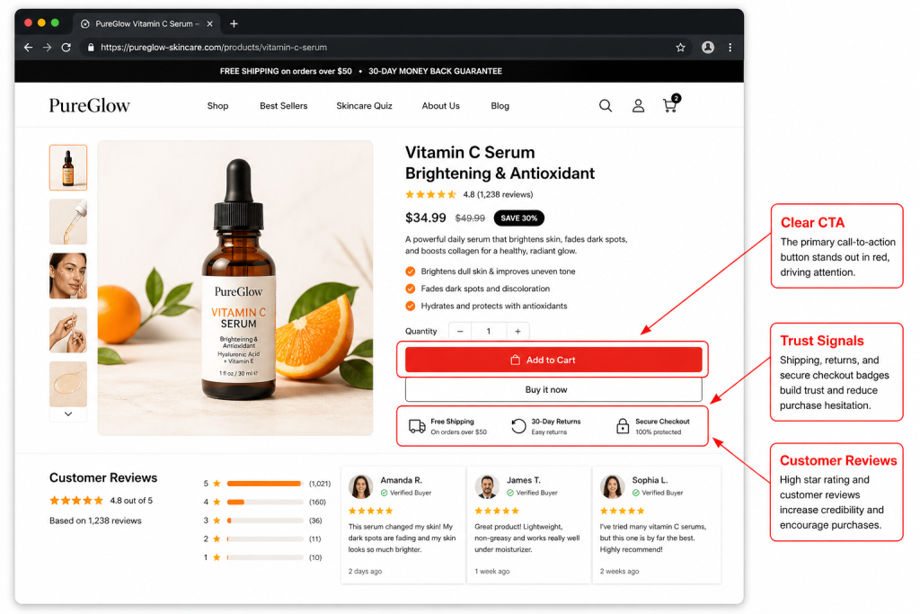
3. Use Social Proof to Build Trust Quickly
In conversion rate optimization UX, trust is the currency. Since users can’t touch your product or meet you in person, they look for “signals” that others have had a positive experience.
Integrating social proof directly into the UX flow, rather than hiding it on a separate page is key:
- Real-time stats: “500 people bought this in the last 24 hours.”
- Contextual reviews: Place star ratings right under the product title.
- Trust Badges: Use secure checkout icons near the final payment button.
This creates a CRO-focused design that answers the user’s subconscious question: “Is this a scam?” before they even have a chance to ask it.
4. Improve Page Speed and Mobile Experience
We have reached a point where UX changes that improve conversion rate are often technical. If your site takes longer than two seconds to load, your conversion rate drops by roughly 7% for every additional second of delay.
Mobile-first design is no longer a suggestion; it is the standard. Users on mobile have “fat fingers” and are often distracted.
- Touch targets: Make sure buttons are large enough to be tapped easily.
- Lazy loading: Only load images as the user scrolls to save initial load time.
Performance Example: An electronics retailer optimized their mobile image sizes and removed heavy scripts, improving load time from 4.5 seconds to 1.8 seconds. This resulted in a 30% reduction in bounce rate and a significant lift in mobile sales.
5. Guide Users with Clear Visual Hierarchy
Using UX design best practices for conversions means controlling where the user looks first. You can achieve this through “Visual Weight.”
- Size: Larger elements attract more attention.
- White Space: Surrounding a CTA with empty space makes it impossible to miss.
- Color Contrast: Use a bold “action color” that isn’t used anywhere else on the page except for buttons.
Think of your page like a story. The headline is the hook, the sub-headline is the context, and the CTA is the conclusion. Without a clear hierarchy, the user gets lost in the “noise.” This is a vital part of social proof for Shopify store making sure the testimonial stands out but doesn’t distract from the “Add to Cart” button.
6. Reduce Form Fields to Minimize Friction
Long forms are conversion killers. Every additional field you ask a user to fill out increases the chance they will abandon the process. To master conversion-focused UX design, you must make the “ask” as small as possible.
- Enable Autofill: Use Google’s Address Autocomplete to save users time.
- Single-Column Layouts: These are easier to read and faster to complete than multi-column forms.
- Guest Checkout: Never force a user to create an account before they buy.
Practical Result: A travel booking site removed three optional fields (title, middle name, and “how did you hear about us”) from their checkout. They saw an immediate 12% increase in completed bookings. It’s simple ecommerce psychology: the easier it is to give you money, the more people will do it.
For Example: UX Changes That Improved Conversion Rate
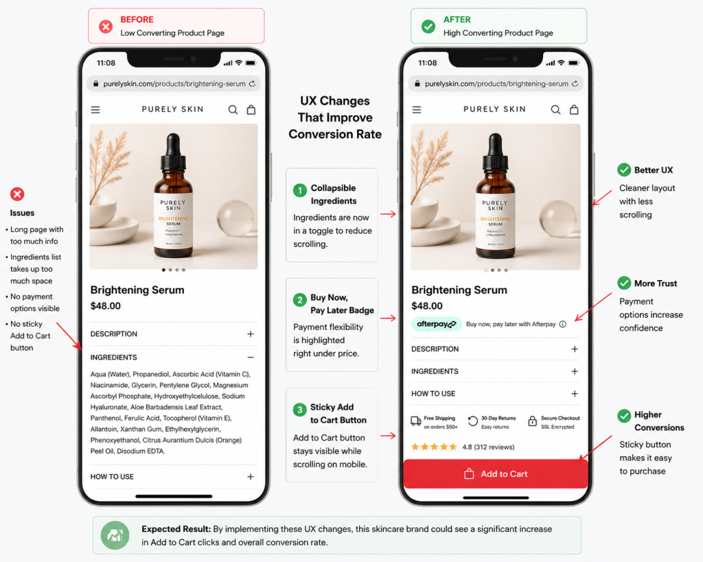
The Scenario:
Imagine a skincare brand receiving steady website traffic but struggling to convert visitors into customers. Analytics tools and user behavior tracking suggest that many users spend time on the product page, scrolling repeatedly but hesitating to click the “Add to Cart” button. This type of behavior is common when the page layout creates friction or overwhelms users with too much information at once.
The UX Improvements:
In this example, the brand focuses on simplifying the user experience and reducing decision fatigue. They implement three targeted UX adjustments:
- They move the Ingredients section into a collapsible toggle to make the page shorter and easier to scan.
- They add a “Buy Now, Pay Later” badge directly below the price to address affordability concerns.
- They introduce a sticky Add to Cart button that remains visible at the bottom of the screen on mobile devices.
These small changes are based on proven Shopify homepage design and mobile usability principles that prioritize clarity and convenience.
The Expected Outcome:
With fewer distractions and clearer purchase signals, users can navigate the page more confidently. In many ecommerce scenarios, reducing scrolling friction and improving visibility of key actions leads to measurable improvements in engagement and sales. This example highlights how thoughtful UX adjustments can help turn hesitant visitors into paying customers.
Common UX Mistakes That Hurt Conversion Rates
No matter how hard you try, tiny mistakes can really hurt. Avoid these common pitfalls:
- Too Many Choices: Don’t overwhelm customers with “Analysis Paralysis” – underline one “Best Seller” or “Recommended” product.
- Hidden CTAs: Don’t hide the next steps.
- Slow Page Speed: This is usually caused by unoptimised images.
- Poor Mobile Layout: If a user has to “pinch and zoom” to read your content, you might as well not even bother.
Keep this in mind when designing for CRO: it should be about taking away, not adding.
Final Thoughts
In 2026 the difference between successful and failed brands is user experience. Conversion-focused UX design is not a one-and-done; it’s an ongoing cycle of learning and improvement.
When you prioritise simplicity, credibility and efficiency, you make sure your site does what it’s supposed to do: generate revenue. Minor tweaks like a shorter form or a brighter button will add up to make a big difference. The first step to fixing your website is to view it from the customer’s perspective: where is it broken? Fix that, and the conversions will follow. Knowing the psychology behind the CTA is the first step of your growth story.