
The color of a product can create up to 90% of quick purchasing decisions. Your brand establishes a hidden dialogue with customers through aesthetic choices. Understanding color psychology for conversions is because it determines whether users make purchases or leave the website.
Brands choose their colors based on their ability to create specific customer reactions which help build trust and drive particular behaviors. The power of color to change how people act exists because I work as an Ecom CRO Expert. The combination of scientific design methods and customer behavior insights enables you to enhance your business operations for better customer retention.
In this guide, we’ll dive deep into:
- Emotional triggers that spark impulse buys.
- Trust-building colors reduce consumer purchasing fears.
- Websites need effective CTA optimization methods for better performance.
- Your e-commerce business uses website color psychology to operate as an invisible sales helper.
What Is Color Psychology in Marketing?
The primary focus of color psychology in marketing field examines how various color shades affect human behavior and perception. People have personal preferences but there exist common psychological responses to all visible colors. The human brain has developed an automatic response system which recognizes specific colors because red indicates danger and ripe berries and blue represents clear skies and pure water.
In a commercial context, brands use these associations to bypass the logical brain and speak directly to the emotional one. Strategically chosen colors can establish:
- Trust: Creating a sense of security and reliability.
- Urgency: Prompting immediate action.
- Luxury: Signaling high-end quality and exclusivity.
- Excitement: Building energy around a new product launch.
By aligning your brand’s visual identity with the desired emotional response of your audience, you create a seamless path toward conversion. When you use CRO-focused design, color becomes a functional tool rather than just a decorative one.
Why Website Color Psychology Matters for Conversions
First impressions online happen in roughly 50 milliseconds. In that blink of an eye, a visitor has already decided if your site feels “safe,” “premium,” or “cheap.” Website color psychology is the primary driver of this instant assessment.
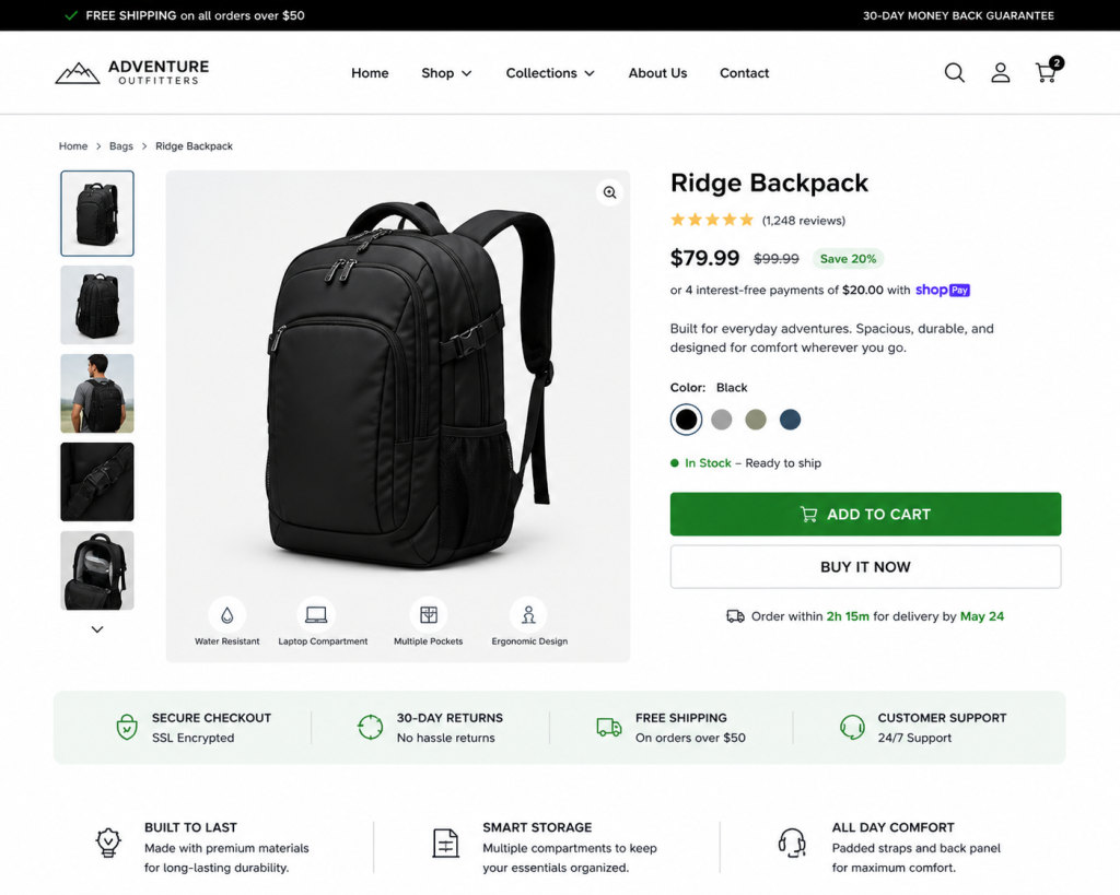
Beyond aesthetics, color dictates visual hierarchy. It tells the user where to look first, what is clickable, and what is secondary information. For instance, high contrast between your background and your Call-to-Action (CTA) button is essential for guiding the user flow. If your “Add to Cart” button blends into the page, your conversion rate will suffer regardless of how good your product is.
Effective conversion-focused UX design utilizes color to reduce cognitive load. Giants like Amazon use a specific shade of orange for their action buttons because it stands out against their neutral interface without feeling aggressive. Netflix uses a high-contrast red-on-black scheme to create a cinematic, immersive feel that encourages binging. If your colors clash or lack hierarchy, you’ll see an immediate spike in bounce rates as users feel subconsciously “stressed” by the interface.
Colors That Increase Sales and Build Customer Trust
To master color psychology for conversions, you need to know which “levers” to pull. Here are the colors that increase sales and the psychology behind why they work.
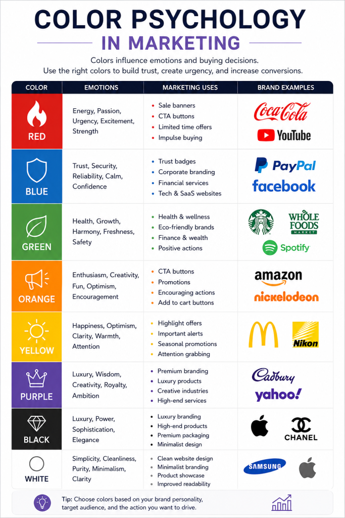
Red : Creates Urgency and Impulse Buying
Red is the color of physical energy. It increases heart rates and creates a sense of immediate urgency. This is why you see red used almost universally for:
- Flash sales and “Last Chance” banners.
- Clearance tags (like Amazon’s “Deal of the Day”).
- Limited-time offers.
CRO Insight: While red is great for impulse buys, overusing it can create “warning fatigue.” If your entire site is red, the user may feel a sense of anxiety or aggression, leading them to exit the store. Use it for the “closer,” not the whole conversation.
Blue : Builds Trust and Security
There is a reason why PayPal, Facebook, and American Express use blue. It is the color of the sky and the sea stable, calm, and reliable. In ecommerce, blue is the ultimate tool for building trust, especially on checkout pages and near trust badges. It tells the customer, “Your data is safe here.”
Green : Encourages Positive Buying Decisions
Green is the easiest color for the human eye to process. It represents growth, health, and “Go.” For eco-friendly brands or wellness products, it’s a natural fit. Interestingly, green CTA buttons often perform exceptionally well in A/B tests because they signal a positive, safe “affirmation” to move forward with a purchase.
Orange and Yellow : Attention-Grabbing Action Colors
Orange is the “friendly” relative of red. It’s energetic but less aggressive. Yellow triggers optimism and happiness. Both are fantastic for CTA buttons because they pop against most backgrounds. Mastering the Psychology of the CTA often involves using orange to draw the eye to a “Subscribe” or “Buy” button without the “danger” vibes of red.
Black : Luxury, Exclusivity, and Premium Appeal
Black signals sophistication and authority. High-end brands like Apple, Chanel, and Nike use black to create a sense of mystery and value. If you are selling a premium product at a high price point, a minimalist black-and-white palette can make your brand feel more “expensive.”
White Space : The Hidden Conversion Booster
White space (or negative space) is just as important as the colors themselves. It allows the eyes to rest and the products to breathe. A cluttered, rainbow-colored site feels “cheap” and overwhelming. Clean white space communicates transparency and a premium user experience.
How Ecommerce Brands Use Color Psychology for Conversions
Successful ecommerce conversion optimization requires a holistic approach. It’s not just about a single button; it’s about the entire journey.
- Product Page Optimization: Using neutral backgrounds to let the product colors pop.
- Consistency: Ensuring your brand colors on social media match the landing page to build familiarity.
- Mobile-First Strategy: Colors often look more saturated on mobile screens. Testing your palette across devices is crucial.
Understanding ecommerce psychology means knowing that a customer’s mood can be shifted by your site’s palette. A well-timed color shift from a calming blue product page to a high-energy orange “Checkout” button can subtly nudge the user through the funnel.
Color Psychology Mistakes That Hurt Sales
Even with the best intentions, color can backfire. Common pitfalls include:
- Poor Contrast: If your text is light grey on a white background, users can’t read it. Accessibility is a conversion factor.
- Cultural Blindness: While white represents purity in the West, it can represent mourning in some Eastern cultures.
- Technical Drag: High-resolution, unoptimized color gradients can slow down your site. To maintain a smooth experience, you must improve core web vitals ecommerce performance, ensuring your visual elements don’t cause lag.
Best Practices to Use Color Psychology Effectively
- The 60-30-10 Rule: Use 60% dominant color, 30% secondary color, and 10% for your “action” (CTA) color.
- A/B Test Everything: Never assume red will beat green. Test it on your specific audience.
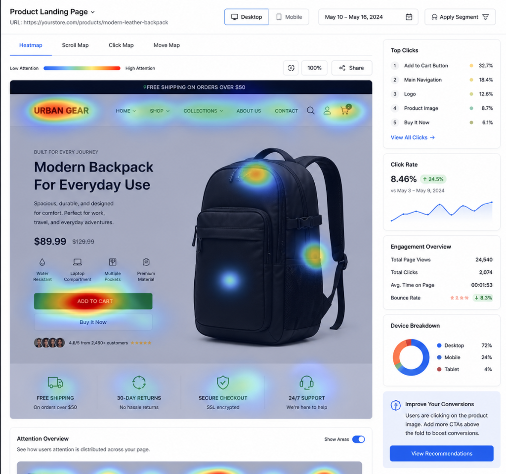
- Use Heatmaps: See where users are looking to ensure your “action colors” are actually getting attention.
- Prioritize Readability: Beauty should never come at the expense of clarity.
Turning Colors Into Conversions
Color serves as the most effective instrument for ecommerce brands to use in their marketing activities. The system operates outside of rational thought which enables it to connect with the emotional aspects that determine whether people make purchases. The combination of website color psychology and a powerful UX design and consistent brand identity creates a shopping space that users experience as natural and safe yet urgent.
Successful brands don’t leave their sales to chance. The company achieves success through its combination of psychological factors and data testing and advanced design techniques. If you want to improve your business results you need to examine your store through the perspective of color psychology and data-driven conversion rate optimization methods.