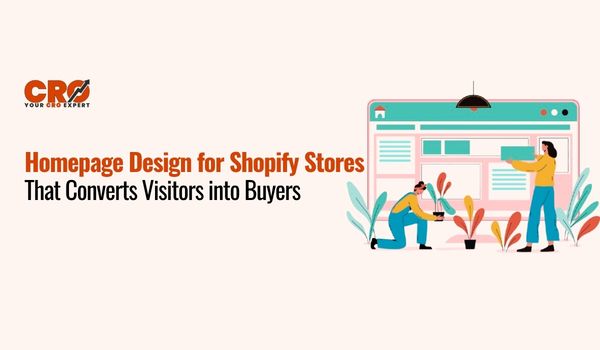
Your homepage is the digital storefront of your business. In the world of e-commerce, it serves as your handshake, your elevator pitch, and your sales floor all at once. Many merchants struggle with the “leaky bucket” syndrome: they spend thousands on ads to drive traffic, only to see a bounce rate that tells a story of missed opportunities. If you have high traffic but low sales, the culprit is likely your Shopify homepage design.
The primary goal of a homepage isn’t just to look “pretty”, it’s to build trust and guide a stranger toward a purchase. In this guide, we’ll break down the specific CRO design strategies required to transform your landing experience from a passive gallery into a high-performance sales engine. You’ll learn how to design a Shopify homepage that converts by focusing on psychology, clarity, and technical excellence.
First Impressions Matter: Above-the-Fold Design
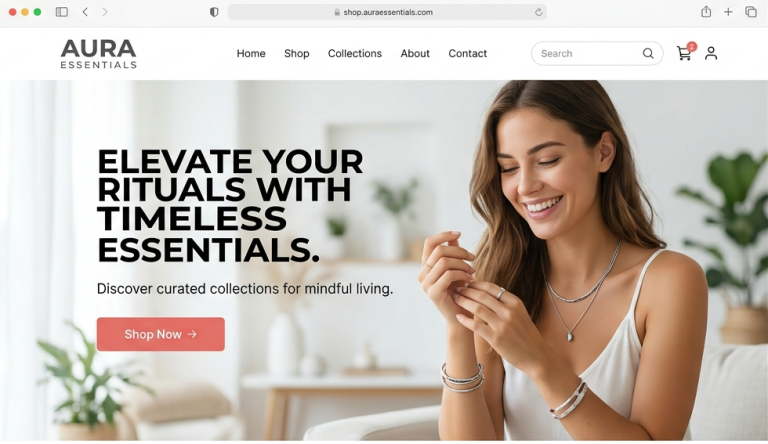
“Above the fold” refers to everything a visitor sees before they start scrolling. This is the most valuable real estate on your site. You have approximately 0.05 seconds for users to form an opinion about your brand. If they can’t figure out what you sell and why they should care within that window, they will leave.
The key to this area is to have a section that has three non-negotiable components:
- A Clear Value Proposition: An eye-catching headline which says your key advantage.
- High-Quality Visuals: An expert image or movie that brings out the lifestyle that your product offers.
- A Strong CTA: A button such as Shop Now or Explore Collection that is conspicuous.
Keep it simple. Putting three types of sliders or rival messages in the hero section causes cognitive dissonance, resulting in analysis paralysis.
Crafting a Clear Value Proposition
Your value proposition is the answer to the customer’s question: “Why should I buy from you instead of Amazon?” A strong value prop focuses on benefits, not just features. For example, instead of saying “We sell organic cotton shirts” (feature), say “Feel the comfort of sustainable luxury with shirts that breathe” (benefit).
Great value propositions are:
- Specific: “Whiten your teeth in 10 minutes” is better than “Get a better smile.”
- Relatable: Speak the language of your target audience.
- Visible: It should be the largest text on the page.
High-Converting Navigation Structure
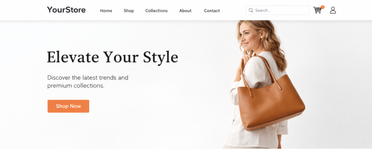
If your navigation is a maze, your customers won’t stick around to solve it. A high-converting menu should be intuitive and lean. Avoid the temptation to list every single sub-category in the main header. Instead, use “Mega Menus” if you have a large catalog, but keep the top-level categories limited to 5–7 items.
Don’t forget the search bar. Shoppers who use the search function are often 2x to 3x more likely to convert because they have high intent. Ensure your navigation is a pillar of high-converting UX design, allowing a user to get from the homepage to a specific product in three clicks or fewer.
Use of Social Proof and Trust Signals
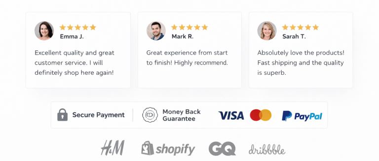
Trust is the medium of exchange in e-commerce. Social proof is what customers seek because they want to be certain that the decision they make is correct since they cannot experience your products. Incorporating the reviews on the home page itself is a changer.
Beyond just star ratings, consider:
- User-Generated Content (UGC): Actual Instagram images of visitors to your products.
- Trust Badges: Screenshots are S.C.O. Buyer protection or 30-day money back guarantee icons at the bottom or CTA.
- Media Mentions: For example, If you add authoritative websites like Vogue or TechCrunch logos create authority immediately.
Product Highlight Sections That Sell
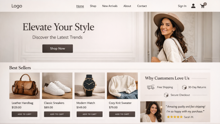
A common mistake in Shopify homepage design is showing too many products at once. Instead, curate your selections. Use a “Featured Collection” section to showcase your bestsellers or new arrivals.
Each product card should include:
- High-Resolution Images: Use hover effects that show the product from a different angle.
- Concise Titles and Prices: Don’t hide the cost; transparency builds trust.
- Quick Add-to-Cart: This feature allows returning customers to buy instantly without leaving the homepage, shortening the path to conversion.
Visual Hierarchy and Design Psychology
Visual hierarchy refers to the procedure of organizing things to suggest significance. You can lead the eye of a user with the help of size, color and blank space. As an example, your “Primary CTA” must be a high contrast colour that will not be visible anywhere on the page but only in the form of buttons.
Whitespace (or negative space) is your friend. It prevents the site from looking “cheap” and allows your products to breathe. Remember, the eye follows a “Z” or “F” pattern on a screen; place your most important information along these natural paths of sight.
Mobile Optimization is Non-Negotiable
More than 70% of Shopify traffic now comes from mobile devices. If you aren’t designing for the thumb, you’re losing money. A mobile-first approach means ensuring buttons are large enough to tap easily (at least 44×44 pixels) and that text remains legible without zooming.
Avoid heavy pop-ups that are impossible to close on a small screen. A truly responsive layout adjusts seamlessly, ensuring that your Shopify product page design looks just as stunning on an iPhone as it does on a 27-inch monitor.
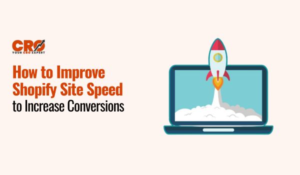
Page Speed and Performance Optimization
Speed is a direct ranking factor for Google and a conversion killer for users. A one-second delay in page load time can lead to a 7% reduction in conversions. To keep your Shopify store snappy:
- Compress Images: Use tools like TinyPNG or Shopify apps to shrink file sizes without losing quality.
- Audit Your Apps: Every app you install adds a script that can slow down your site. If you aren’t using it, delete it.
- Use a Fast Theme: Choose themes optimized for “Core Web Vitals.”
Strategic Call-to-Actions (CTAs)
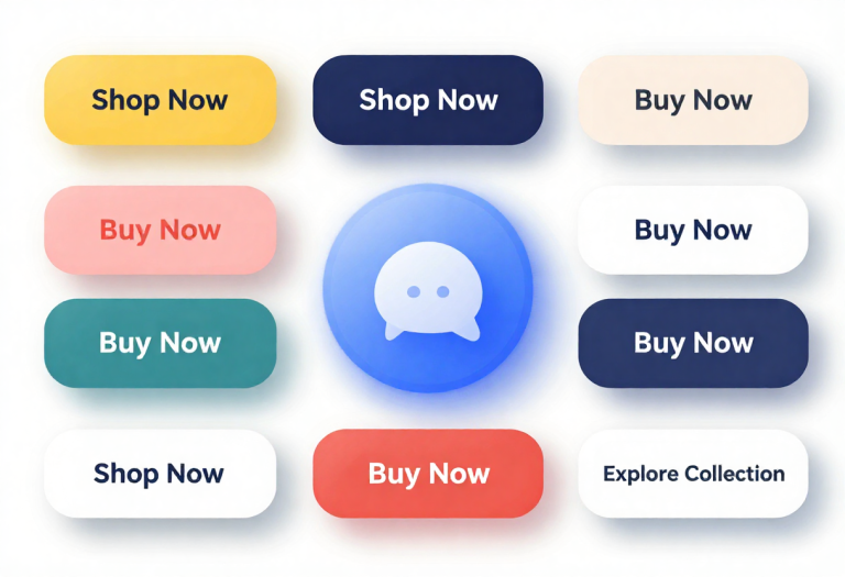
Your CTAs should be action-oriented and unambiguous. Instead of “Submit,” use “Get My Discount” or “Start My Transformation.”
Strategically place CTAs throughout the page:
- Primary CTA: In the Hero section.
- Secondary CTAs: Underneath featured collections or “About Us” sections.
- Sticky Header: Keep a small “Shop” button visible even as the user scrolls down.
Personalization and User Experience
Modern shoppers expect a personalized experience. Shopify allows for dynamic content, such as showing “Recently Viewed Products” or geo-targeted offers (e.g., “Free Shipping to New York”).
Personalization makes the user feel seen. If you want to take this further, consider an A/B testing explanation to understand which personalized elements actually move the needle. By testing two versions of a headline or image, you can let data, rather than guesswork, dictate your design.
Common Homepage Mistakes to Avoid
Even the best brands fall into these traps:
- Auto-Playing Music/Video: This is intrusive and often leads to an immediate exit.
- Too Many CTAs: If everything is a priority, nothing is. Stick to one main goal per section.
- Broken Links: Nothing kills trust faster than a 404 error on the homepage.
- Lack of Contact Info: Ensure your footer has an email, phone number, or live chat link.
Conclusion: Audit, Optimize, Repeat
Understanding how to design a Shopify homepage that converts is an ongoing process. Fashions come and go and customer habits change. Homepage as a living laboratory is the best feature of the most successful e-commerce brand.
You may not have to go it alone in case you are feeling overwhelmed. Many brands choose to partner with a CRO Expert Company to dive deep into CRO Design (Conversion Rate Optimization) and identify friction points that are invisible to the untrained eye.
Is your home page serving you or not? Begin by today by conducting an audit of your above the fold section. Make it very clear that you have a value proposition, and your shop now button cannot be overlooked.