
In 2026, online shopping has moved from the desktop monitor to the palm of the hand. Mobile commerce (m-commerce) now accounts for nearly 60% of all online retail sales worldwide, with global revenue projected to hit a staggering $4.01 trillion this year. But there is a frustrating paradox about it: smartphones are the most popular devices driving over 75% of e-commerce traffic, mobile conversion rates tend to be half those of their desktop counterparts. This mobile gap is the largest unexploited revenue source to Shopify merchants. (sources)
To quit missing money on the table, you will need to go beyond a responsive site and go mobile first. By leveraging must have Shopify apps 2026 designed for speed and seamless UX, you can bridge this gap effectively. In this guide, you will be taught how to optimize Shopify store for mobile conversions by refining the UX, relying on AI-driven solutions, and simplifying the checkout process to convert random scrollers into loyal customers.
What is Mobile CRO?
Mobile Conversion Rate Optimization (CRO) is the evidence-based strategy of boosting the rate of mobile traffic that executes a preferred activity – usually a purchase. Mobile users, unlike desktop users, might be on the move, distractible, and have less screen space since they can have many tabs open, and have a physical keyboard.
To overcome this gap, a lot of brands hire a shopify cro expert who will find out the friction points that cannot be noticed on a bigger monitor. The focus on Shopify mobile conversion optimization is not only about reducing the size of pictures but also redesigning the whole purchasing process in such a way that it would fit the specific ergonomics and psychological stimuli of a smartphone user.
Why Mobile Conversions Are Lower
The struggle to convert on mobile isn’t a lack of interest, it’s a lack of ease. The primary culprits include:
- Input Friction: Typing an address or credit card number on a tiny glass screen is a high-effort task that leads to a 97% abandonment rate on mobile sites compared to apps.
- Limited Attention: Mobile users are frequently interrupted by notifications or physical surroundings, making a complicated navigation menu a “bounce” trigger.
- Variable Speeds: A store that loads in 2 seconds on office Wi-Fi might take 8 seconds on a spotty 5G connection in a moving train.
- Hidden Costs: If shipping fees aren’t clear until the final step, mobile users, who value transparency, will vanish instantly.
Core Principles of Mobile Optimization
To master how to optimize Shopify store for mobile conversions, you must follow three core pillars:
- Thumb-Friendly UX: Every interactive element must be within the “natural reach” of a thumb.
- Visual Hierarchy: High-priority items (Product Image, Price, CTA) must appear “above the fold.”
- Radical Simplicity: If a feature doesn’t help the user buy, it’s a distraction.
For a deeper look into your site’s health, a professional cro audit can reveal whether your current layout is helping or hurting these principles.
10 Proven Mobile CRO Strategies for Shopify
1. Optimize Page Load Speed
Speed is the ultimate conversion killer. Use WebP image formats and lazy loading to ensure your “Largest Contentful Paint” (LCP) is under 2.5 seconds. Lightweight, 2.0-compliant Shopify themes are no longer optional, they are a necessity.
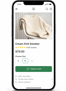
2. Use a Sticky Add-to-Cart Button
As users scroll through long product descriptions, the “Add to Cart” button can disappear. A sticky footer CTA ensures the “Buy” option is always a thumb-tap away. This simple shift in CRO webdesign can significantly reduce cart abandonment.
3. Simplify Navigation
Ditch the massive mega-menus. Use a clean “hamburger” menu and a prominent search bar with AI-powered autocomplete. The faster a user finds a product, the less time they have to change their mind.
4. Improve Product Pages
Mobile shoppers rely heavily on visuals. Use high-resolution images with “pinch-to-zoom” and short, scannable bullet points for descriptions. Avoid massive blocks of text that require endless scrolling.
5. Streamline Checkout Process
Enable “One-Click” checkouts. By the time you’re looking for Shopify apps, ensure you’ve integrated Shop Pay, Apple Pay, and Google Pay. These “wallet” solutions bypass the need for manual data entry, which is the #1 cause of mobile drop-offs.
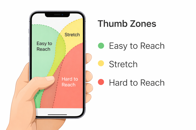
6. Optimize for Thumb Zones
Place your most important buttons in the bottom-middle of the screen. Avoid placing critical links in the top corners, which are the hardest areas to reach during one-handed use.
7. Use Trust Signals
On a small screen, trust is fragile. Display star ratings immediately under the product title and place “Secure Checkout” badges near the final payment button. Social proof should be integrated, not hidden.
8. Reduce Pop-ups & Distractions
Intrusive interstitials that cover the whole screen are penalized by Google and hated by users. If you must use pop-ups, ensure they only cover 30% of the screen and have a massive “X” that is easy to tap.
9. The Psychology of the CTA
Understanding the Psychology of the CTA is vital. On mobile, use high-contrast colors (like safety orange or electric blue) and action-oriented text like “Get Mine Now” instead of a generic “Submit.”
10. A/B Test Everything
Never guess what works. Test different button placements, header styles, and even font sizes. What works for a fashion brand might fail for a high-tech gadget store.
Shopify Tools & Apps for Mobile CRO
In 2026, the ecosystem is more advanced than ever. When considering how to design a Shopify homepage that converts, you should look into Shopify apps to grow your store.
- Speed: TinyIMG for automated image compression.
- Social Proof: Judge.me for fast-loading, photo-rich reviews.
- Retention: PushOwl for mobile-specific push notifications that bring users back without needing an email.
- Personalization: AI engines that re-rank your collection pages based on real-time mobile behavior.
Common Mobile CRO Mistakes to Avoid
The most frequent error is “Desktop Mirroring”, assuming that if it looks good on a Mac, it works on an iPhone. Other pitfalls include:
- Tiny Tap Targets: Buttons that are too close together, leading to “fat-finger” errors.
- Forced Account Creation: Requiring a login before checkout is the fastest way to lose a mobile sale.
- Non-Responsive Media: Videos that don’t scale properly or block the scroll flow.
How to Measure Mobile CRO Success
You can’t manage what you don’t measure. Track these mobile-specific metrics in Shopify Analytics:
- Mobile Conversion Rate vs. Desktop: Aim to keep the mobile rate within 50-70% of desktop.
- Average Session Duration: Are they engaging or bouncing immediately?
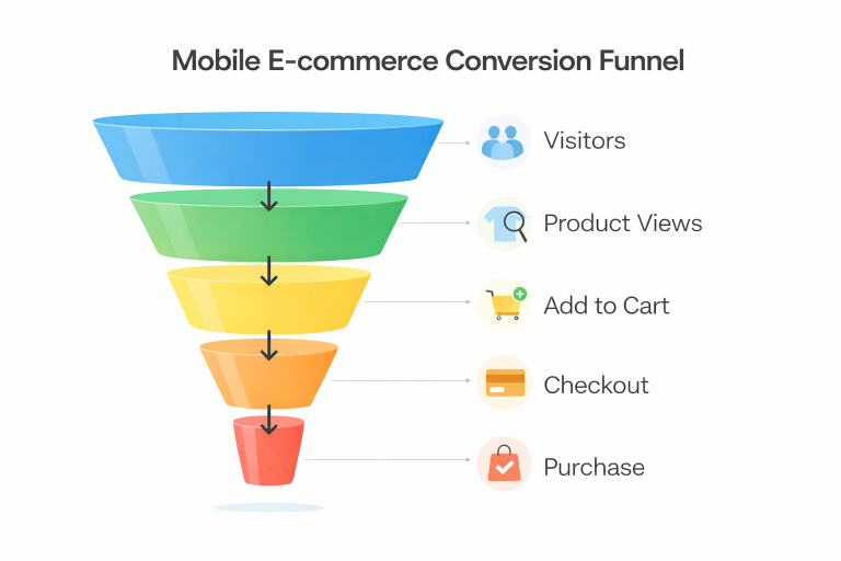
- Cart-to-Detail Rate: How many people who view a product actually add it to their cart?
The Bottom Line
Mastering Shopify mobile conversion optimization is a journey, not a destination. As mobile technology evolves toward AI-integrated shopping and augmented reality “try-ons,” the stores that prioritize a frictionless, thumb-friendly experience will be the ones that thrive. Start by fixing your page speed and simplifying your checkout process today, even a 1% increase in mobile conversion can lead to a massive lift in your annual bottom line.