Setting up a Shopify store is easier than ever, yet there is an issue with getting people to actually press that “Buy Now” button. And that is where the real struggle is. It is possible to pay thousands of Tik Tok advertisements or Google optimization to get visitors, but then with an untidy, slow, or unclear landing location, you are adding water to a leaky bucket.
The secret to a successful e-commerce business isn’t just the product itself; it’s the Shopify product page design. This page is the closest in your sales funnel. It is where the customer makes the decision of whether or not he or she trusts you to such an extent that they will give you their credit card. In this guide, we’ll dive deep into how to design high-converting Shopify product pages that turn casual browsers into loyal customers using proven CRO design (Conversion Rate Optimization) principles.
Why Shopify Product Page Design Matters for Conversions
Your product page is your digital salesperson. Unlike a physical store, customers can’t touch the fabric, smell the candle, or try on the shoes. Your design has to bridge that sensory gap.
A well-optimized page builds instant trust. When a page looks professional, loads fast, and answers every possible question, the perceived risk of buying drops. Conversely, a poor layout leads to a high bounce rate. If a user has to hunt for the price or can’t figure out how to select a size, they’ll leave and go to Amazon. This is why Shopify CRO is a continuous process of refining the user experience (UX) to ensure the path to purchase is as frictionless as possible.
Essential Elements of a High-Converting Shopify Product Page
In order to create a selling page, you must master the three bigs, Visuals, Titles, and Descriptions.
High-Quality Product Images
Humans are visual creatures. Your images on a product page do 80 percent of the heavy lifting.
- Multiple Angles: Don’t just show the front. Display the back, the side and the inside.
- Zoom Functionality: Let users see the texture. Photos in high resolution, which can be zoomed, will assure the buyer of the quality.
- Lifestyle Images: Show the product in action. Sell a backpack, demonstrate it to a person in a metropolis. This would make the customer imagine the product in his life.
- Consistent Style: Make sure that your photos are all lit and backgrounded. An untidy gallery appears amateurish.
Clear and Compelling Product Titles
Your title should tell the user exactly what they are looking at within one second.
- Include Primary Keywords: This helps with both UX and SEO.
- Keep it Descriptive: Instead of “Blue Shirt,” try “Men’s Slim-Fit Organic Cotton Shirt – Navy Blue.”
- Avoid Stuffing: Don’t pack it with 20 keywords for Google. Write for the human first.
Persuasive Product Descriptions
Most store owners make the mistake of listing only technical specs. Boring!
- Focus on Benefits: Instead of saying “Waterproof material,” say “Keeps your belongings dry even in a downpour.”
- Scannability is Key: Use bullet points. Most people don’t read every word; they skim.
- Address Pain Points: If people usually worry about a product being too heavy, mention how lightweight yours is right in the description.
Optimize Your Call-to-Action (CTA)
The “Add to Cart” button is the most important element on the screen. CRO focused design dictates that this button should be impossible to miss.
- Prominent Placement: It should be “Above the Fold,” meaning the user shouldn’t have to scroll down to find it.
- Contrast is King: If your website is mostly white and blue, make your CTA button bright orange or green. It needs to “pop” against the background.
- Add Urgency: Phrases like “Only 3 left in stock!” or “Sale ends in 2 hours” can nudge a hesitant buyer to take action.
- The Sticky CTA: For longer mobile pages, use a “sticky” button that stays at the bottom of the screen as the user scrolls.
Build Trust with Social Proof
Why should a stranger trust your store? Because other people did. Incorporating social proof is a core pillar of Shopify conversion rate optimization tools and strategies.
- Reviews and Ratings: Display star ratings right under the product title.
- User-Generated Content (UGC): Seeing a photo of a real customer using the product is 10x more powerful than a studio photo. It proves the product is real and as described.
- Trust Badges: Display icons for “Secure Checkout,” “Free Returns,” or “100% Organic.” These small visual cues reduce “buyer’s remorse” before it even happens.
Improve User Experience and Navigation
If your site is hard to use, people won’t buy. It’s that simple. Shopify product page optimization requires a clean, “breathable” layout.
- Mobile-Friendly Design: Over 70% of Shopify traffic comes from mobile. If your buttons are too small or your images don’t resize properly, you are losing money.
- Fast Loading Speed: A two-second delay in load time can increase bounce rates by 50%. Compress your images and limit heavy apps.
- Simple Variant Selection: Make it incredibly easy to switch between colors and sizes. Use “swatches” (visual color circles) instead of just a dropdown menu whenever possible.
Use Conversion-Focused Design Techniques
To truly master how to design high-converting Shopify product pages, you need to look at the psychology of the page.
- Feature Icons: Use small icons (like a little truck for fast shipping or a leaf for eco-friendly) to highlight key selling points. Icons are processed faster than text.
- Transparent Info: Don’t hide shipping costs until the final checkout step. Show “Free Shipping over $50” or “30-Day Easy Returns” right near the Add to Cart button.
- The Power of Whitespace: Don’t clutter the page. Give your text and images room to breathe so the user doesn’t feel overwhelmed.
Use SEO to Drive Organic Traffic
While we want to convert the traffic we have, we also want Google to send us more.
- Alt Text: Every image should have “Alt Text” describing it (e.g., “Large Black Leather Travel Bag”).
- Structured Headings: Use H1 for the title, H2 for the main sections, and H3 for sub-details. This helps search engines understand your page hierarchy.
- Internal Linking: Link to “Related Products” at the bottom of the page. This keeps users on your site longer and helps SEO.
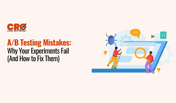
A/B Testing for Continuous Improvement
You might think a red button works best, but your customers might prefer blue. You won’t know until you test. A/B testing for Shopify allows you to show two versions of a page to different users to see which one performs better.
What should you test?
- Hero Images: Does a studio shot or a lifestyle shot convert better?
- CTA Text: “Add to Cart” vs. “Buy Now.”
- Price Placement: Does putting the price in a larger font help or hurt?
To truly understand user behavior, you should learn how to analyze heatmaps for e-commerce. Heatmaps show you exactly where users are clicking and how far down they are scrolling. If everyone stops scrolling before they hit your reviews, you need to move the reviews higher up!
Common Mistakes to Avoid
Even the best brands fall into these traps:
- Hidden Shipping Costs: This is the #1 reason for cart abandonment. Be upfront.
- Poor Image Quality: If the photo is blurry, the product feels cheap.
- App Overload: Installing too many Shopify conversion rate optimization tools can actually slow your site down so much that it kills your conversions.
- Lack of Contact Info: If a customer has a question and can’t find a “Contact Us” link or a Chat button, they will leave.
Conclusion
It is not by chance that successful Shopify product pages can be created but a design. A combination of quality visuals, compelling benefits-based messages, and excellent social persuasion will create a safe and thrilling buying experience.
It is important to remember that Shopify CRO is a marathon and not a sprint. Begin by reviewing your existing pages: Are your photos sharp? Is your CTA button obvious? Is the page fast on mobile? After the basics are corrected, proceed to A/B testing, and heatmap analysis to optimize your findings.
Audit your store now, make these small changes and see your conversion rate and your business take off.