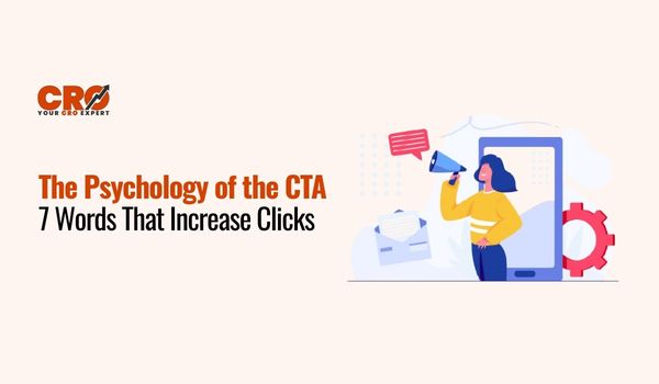
This is something we have all gone through. You are surfing a site, you admire the product and you are about to make a decision. And then there is a button that reads SUBMIT. All of a sudden it starts to feel like work. It is formal, cold and somewhat uncomfortable as you are passing on your information to a machine.
Suppose the same button said GET MY GUIDE. More friendly and helpful, right? That slight variation reveals the true Psychology of the CTA Words. How people feel depends on the words on your button in seconds. They are able to make something a task or a prize.
The most significant aspect of your site is your CTA (Call to Action). This is the place of decisions in Conversion Rate Optimization (CRO). You may have lots of traffic visiting your site, but unless your buttons are able to address people in a straightforward and friendly manner, you may lose potential customers. This is why it is important to select the appropriate call to action words.
Companies that succeed are interested in developing high-converting CTAs since they understand that minor changes in words can make a significant difference. A button is not a mere design feature, it is a message. when using the best CTA words for conversions it will help you make the visitors know what they will receive and why they need to click.
Then lets see what happens in the brain when an individual chooses to press a button- and why some words are better than others.
The Neuroscience Behind Every Click
Before we talk about the most persuasive CTA words, it helps to understand what happens in the brain when someone visits your website.
When a person lands on your page, two important parts of the brain start working. The first is the Prefrontal Cortex, which handles thinking and decision-making. This part of the brain asks questions like:
- Is this safe?
- Is this worth it?
- Should I click?
The second part is the Amygdala, which controls emotions and quick reactions. This is the part of the brain that responds to feelings like excitement, trust, or curiosity.
If your CTA uses simple but formal words like Submit, Proceed, or Continue, the thinking part of the brain takes over. The user pauses and starts analyzing the decision. Sometimes, that hesitation is enough to stop them from clicking.
But when your CTA uses friendly, benefit-focused language, the emotional part of the brain responds first. People feel more comfortable and confident about taking action. This is why the right words can make such a big difference.
Another important factor is dopamine, often called the “reward chemical.” What’s interesting is that dopamine increases when people expect something good to happen even before they get it.
For example, when a button promises value, like:
- Get My Free Guide
- Start My Trial
- Unlock My Discount
the brain feels a small sense of reward before the click even happens. That positive feeling encourages action.
There is also something called decision fatigue. Online users see many options every day with different products, offers, and buttons. Too many choices can make people feel tired and unsure.
A clear and simple CTA solves this problem. It answers one basic question:
“What should I do next?”
When the answer is obvious and feels helpful, people are much more likely to click. That’s the power behind the Psychology of the CTA Words using simple, human language to guide people toward action.
The Golden 7: Words That Drive 30% More Clicks
Now let’s explore the seven power words that consistently increase clicks. Each word works because it taps into a specific psychological trigger.
1. “You” or “Your” – The Personalization Effect
Humans are naturally self-focused. We pay more attention to messages that feel directly relevant to us. That’s why using “you” or “your” can dramatically improve engagement.
Compare these two CTAs:
- “Download The Guide”
- “Download Your Guide”
The second version feels personal. It implies ownership and relevance. The brain subconsciously thinks, “This is for me.”
Other examples include:
- “Grow Your Business”
- “Build Your Website”
- “Start Your Plan”
Personal language strengthens emotional connection and increases the likelihood of action.
2. “Free” – The Zero-Price Advantage
Few words are as powerful as “Free.” Behavioral economist Dan Ariely explains in Predictably Irrational that people irrationally overvalue free offers, even when paid alternatives provide better value.
The reason is simple: free eliminates risk. There is no downside. No financial commitment. No perceived loss.
Examples include:
- “Start Your Free Trial”
- “Download Free Checklist”
- “Get Free Access”
When used authentically, “Free” lowers psychological resistance and encourages immediate engagement.
3. “Because” – The Need for Justification
One of the most fascinating psychology experiments, often called the Harvard “Xerox Study” showed that people were significantly more likely to comply with a request when given a reason, even a simple one.
The brain craves logic and explanation. When users understand why they should act, hesitation decreases.
For example:
- “Sign Up”
- “Sign Up Because Spots Are Limited”
Adding “because” provides justification and reduces friction. It satisfies the brain’s need for reasoning.
4. “Now” – The Urgency Trigger
Procrastination is one of the biggest enemies of conversion. Users often intend to act but delay the decision. The word “Now” introduces immediacy and reduces hesitation.
For example:
- “Download Now”
- “Join Now”
- “Claim Your Spot Now”
This word activates loss aversion, the fear of missing out. It signals that waiting may result in losing an opportunity. When used ethically, urgency is a powerful motivator.
5. “New” – The Novelty Bias
The human brain is naturally drawn to new experiences. Novelty signals growth, innovation, and improvement. When users see the word “New,” it triggers curiosity and releases dopamine.
Examples include:
- “Explore New Features”
- “Discover What’s New”
- “Try Our New Dashboard”
If your product has updates, improvements, or fresh content, highlighting novelty can significantly increase engagement.
6. “Join” – The Belonging Principle
Humans are social creatures. We seek connection and validation. The word “Join” implies community and shared experience.
Compare:
- “Sign Up”
- “Join 5,000 Marketers”
The second feels safer and more appealing because it includes social proof. It suggests others have already taken action.
Examples include:
- “Join Our Community”
- “Join 10,000 Subscribers”
- “Join the Movement”
Belonging reduces perceived risk and increases trust.
7. “Get” – The Reward-Oriented Verb
The difference between “Submit” and “Get” is subtle but powerful. “Submit” implies effort or giving something away. “Get” implies receiving value.
For example:
- “Submit Your Info”
- “Get My Free Report”
“Get” shifts focus to the reward. It reinforces benefit and increases motivation. That’s why many high-converting CTAs start with this simple verb.
Beyond the Word: The Anatomy of a High-Converting Button
If the words are the “soul” of your CTA, the design is the “body.” To reach that 30% lift, you must optimize the visual experience.
- The “First-Person” Hack
One of the most famous A/B tests in CRO history involved changing “Start your free trial” to “Start my free trial.” This one-word change resulted in a 90% increase in click-through rate. Why? Because it puts the user in the driver’s seat of the narrative. Small psychological shifts like this are exactly the kind of practical strategies covered in this detailed CRO guide for 2026 with tips and tricks that work, showing how minor wording changes can lead to major conversion lifts. - Color Psychology: Contrast is King
There is no “magic color” for conversions. A red button isn’t always better than a green one. The key is Visual Hierarchy. Your button should be the most contrasting element on the page. If your site is mostly blue, use an orange button. This is known as the Von Restorff Effect: the brain remembers and notices the “sore thumb” first. - Fitts’s Law and Negative Space
Fitts’s Law states that the time to acquire a target is a function of the distance to and size of the target. In plain English:
Make it big enough to click (especially on mobile).
Surround it with white space. If your CTA is cluttered by text or images, the “Information Scent” gets diluted.
Testing Your New CTAs: Don't Guess, Measure
A 30% increase is an average, but your audience is unique. To ensure these words work for you, implement a simple testing framework:
- The 5-Second Test: Show your page to a stranger for 5 seconds. If they can’t tell you exactly where they are supposed to click, your CTA is failing.
- Heatmapping: Use tools like Hotjar or Microsoft Clarity to see where users are hovering. If they are hovering over your CTA but not clicking, your copy is the problem. If they aren’t seeing the button at all, your design is the problem. This is where smart CRO design decisions make a real difference, because effective layout, contrast, spacing, and visual hierarchy determine whether your CTA gets noticed or ignored.
- A/B Testing: Only test one word at a time. If you change the word, the color, and the placement all at once, you’ll never know which change actually drove the results.
How to Start Today
Don’t go and change every button on your site at once. That’s a recipe for confusion.
- Pick your most important page (like your homepage or a top blog post).
- Swap one word. Change “Submit” to “Get My [Benefit].”
- Watch your data. Give it 7 days. If the clicks go up, move on to the next page.
CRO isn’t about tricking people. It’s about making it as easy as possible for them to say “Yes.”